A payroll analytics dashboard puts all your payroll data in one place, making it easy to understand. Instead of searching through payslips, spreadsheets, and reports, you can quickly see payroll costs, overtime, absences, and pay trends.
This helps HR and finance teams spot issues early, manage spending, and make better decisions regarding the workforce. It doesn’t just show the numbers, it also helps you understand what they mean and what action to take.
What is a payroll analytics dashboard?
A payroll analytics dashboard is a visual report that brings all your key payroll data into one place. It shows important information such as payroll costs, gross and net pay, overtime, bonuses, employer contributions, and pay by team or location.
Instead of searching through multiple reports or spreadsheets, you can see the most important figures in easy-to-read charts, tables, and summaries.
A payroll analytics dashboard helps answer questions like:
- How much are we spending on payroll this month?
- Have payroll costs increased or decreased?
- Which teams are working the most overtime?
- Are absences increasing labour costs?
- Are there any pay gaps that need attention?
- Is headcount growing within budget?
- Have there been any unexpected payments or deductions?
Because payroll is one of the largest business expenses, a dashboard makes it easier to track costs, spot trends, and make informed decisions to control budget. By bringing payroll data together, you can quickly identify changes in hiring, turnover, overtime, leave, and pay patterns. Read our article to understand what a payslip includes in the UK.
A payroll analytics dashboard is an important tool that can be very useful when taking a holistic approach to mastering your company finances.

Why use payroll analytics?
Payroll data is useful for much more than running payroll. By tracking it over time, you can spot trends in labour costs, overtime, absences, and pay that help you make better business decisions.
Instead of reacting to problems after they happen, payroll analytics helps you identify issues early and understand what’s driving payroll costs.
Keep track of payroll costs
Payroll costs change for many reasons, including new hires, pay rises, bonuses, overtime, and employee absences.
A payroll analytics dashboard lets you compare payroll costs across different months, years, or against your budget, making it easier to identify unexpected increases and investigate the cause.
Spot payroll errors sooner
Payroll mistakes can be costly and damage employee trust.
A dashboard helps highlight unusual activity, such as:
Unexpectedly high or low payments
- Unusual overtime
- Missing allowances or deductions
- Sudden increases in team labour costs
- New starters with incorrect payroll records
While it doesn’t replace payroll checks, it provides an extra layer of visibility before payroll is finalised.
Improve budgeting and forecasting
Payroll is one of the largest business expenses, so understanding where the money goes makes budgeting easier.
Payroll analytics helps HR and finance teams forecast future costs, plan recruitment, prepare for pay reviews, and manage seasonal demand with greater confidence.
Manage overtime more effectively
Regular overtime can increase costs and lead to employee burnout.
A payroll dashboard shows which teams are working the most overtime, helping managers identify staffing shortages, uneven workloads, or scheduling issues before they become bigger problems.
Support fair and consistent pay
Payroll analytics makes it easier to monitor pay across departments, locations, roles, and employee groups.
While dashboards don’t explain why pay differences exist, they help identify areas that may need further investigation, supporting pay parity and gender pay gap reporting.
Connect payroll with workforce performance
Payroll data becomes even more valuable when combined with HR and business data.
By comparing payroll costs with headcount, turnover, absence, recruitment, and business performance, organisations can better understand how workforce changes affect overall results.
For example, rising payroll costs without increased productivity may indicate overstaffing, while higher absence and overtime together could suggest teams are under pressure.
Benefits of a payroll analytics dashboard
A payroll analytics dashboard makes payroll data easier to understand and act on. Instead of working through spreadsheets and reports, you can quickly see key trends and make informed decisions.
Some of the biggest benefits include:
Save time on reporting
Many HR and finance teams still spend hours exporting data, updating spreadsheets, and creating reports by hand.
You can use an AI platform like Factorial to create a payroll dashboard tat automates much of this work by bringing your payroll data together in one place, giving your team more time to analyse results instead of preparing reports.
Give leaders a clearer picture
Business leaders need a summary with clear insights, not long pages of payroll data.
A dashboard highlights the most important metrics, making it easy to see what’s changed, what’s driving payroll costs, and where action may be needed.
Make better workforce decisions
With a clear view of payroll spending, managers can make more informed decisions about hiring, overtime, staffing levels, and workforce planning.
Seeing the true cost of each team also helps with budgeting and future growth plans.
Improve confidence in payroll data
A shared dashboard gives HR, finance, and managers one reliable source of payroll information.
This reduces confusion caused by different spreadsheets and reports while helping everyone make decisions using the same up-to-date data.
What should a payroll analytics dashboard include?
A good payroll analytics dashboard focuses on the metrics that matter most to your business. Rather than filling your screen with charts, it should help you answer key questions about payroll costs, workforce trends, and business performance.
Here are the core metrics to include.
1. Total payroll cost
Track your total payroll spend over time, including salaries, wages, overtime, bonuses, and employer contributions where relevant.
Comparing payroll costs by month, quarter, or against budget helps you understand spending trends and identify unexpected changes, and they help you benchmark salaries as well.
2. Gross pay and net pay
Show both gross pay (before deductions) and net pay (take-home pay).
Monitoring both figures helps you understand overall payroll costs and quickly spot unusual changes that may need reviewing.
3. Headcount and staff costs
Displaying headcount alongside payroll costs provides useful context.
For example, rising payroll costs may simply reflect business growth—or they may indicate higher pay, increased overtime, or bonus payments without an increase in employee numbers.
4. Overtime
Track overtime hours and costs by team, department, manager, or location.
This helps identify areas where workloads are increasing and where hiring or better resource planning could reduce overtime costs.
5. Absence and sick pay
Monitor trends in sickness, annual leave, unpaid leave, parental leave, and other absences.
Looking at patterns over time can help identify teams that may need additional support or changes to staffing levels.
6. Bonuses, commission, and allowances
Include additional payments such as bonuses, commission, shift allowances, and travel expenses.
Tracking these separately makes it easier to understand what’s driving payroll costs and ensure spending aligns with business objectives.
7. Employer contributions
Include employer costs such as National Insurance and pension contributions to show the true cost of employing staff.
This gives finance teams a more accurate picture of total labour costs and supports better budgeting.
8. Labour costs by team or location
Break payroll costs down by department, cost centre, or location to see where your budget is being spent.
Comparing teams can help identify trends, support resource planning, and highlight areas that may need further investigation. The goal isn’t to judge performance from payroll data alone, but to provide a starting point for better decision-making.
With a platform like Factorial, AI features actually make it possible for you to ask questions in plain English and get answers about your costs and other metrics. The actual work of creating the report is outsourced to AI agents so that you can focus on the strategic task of making the decisions.
Payroll analytics dashboard examples
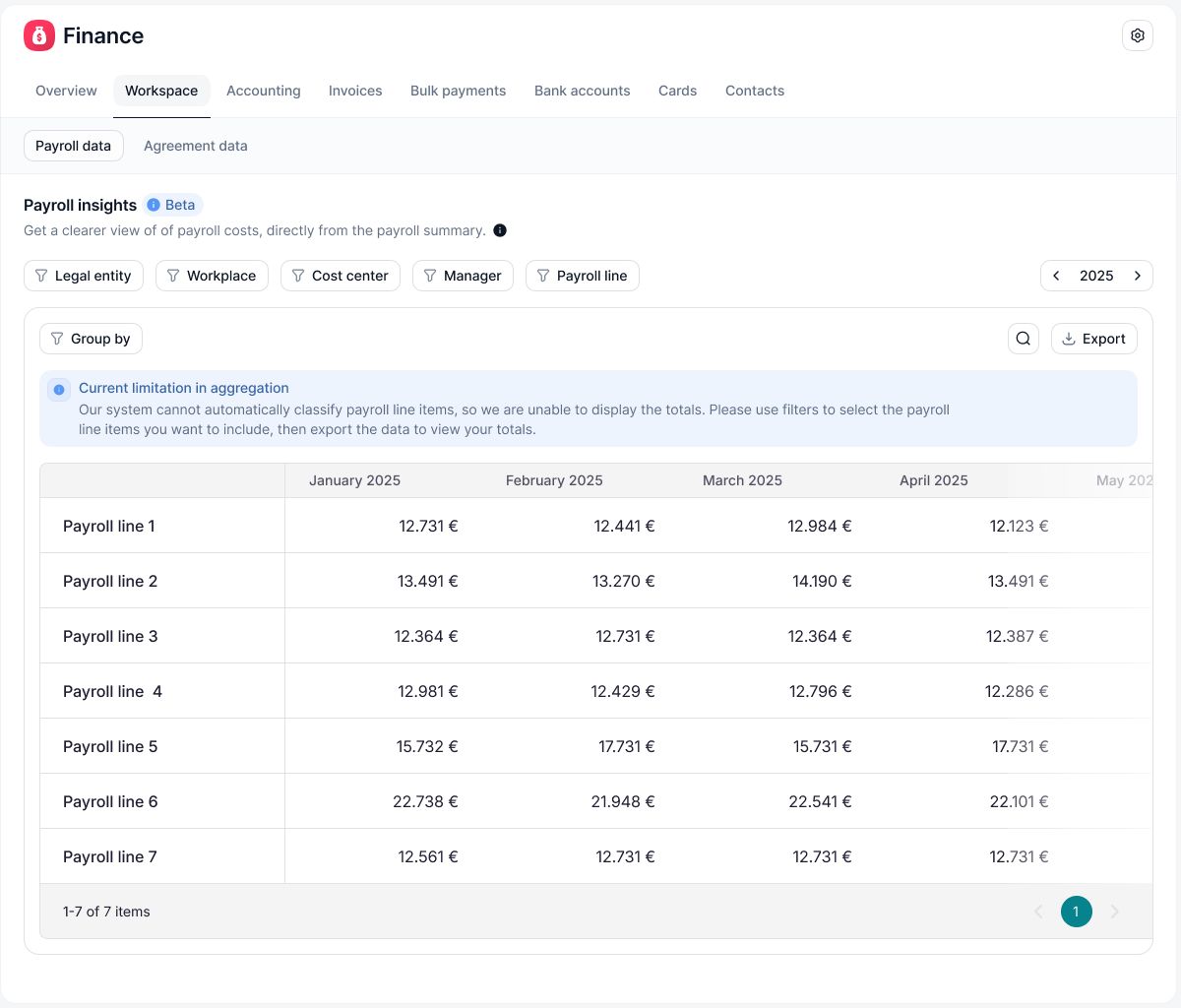
A payroll analytics dashboard can help businesses understand what is happening with their workforce and make better decisions. Here are some simple examples:
Example #1: Spotting a staffing gap
A customer support team sees a 25% increase in overtime costs over three months. The dashboard also shows higher sickness absence and two recent employee departures.
This suggests the team may be understaffed. Instead of relying on regular overtime, the business can consider hiring, temporary support, or redistributing workloads.
Example #2: Planning for growth
A business is preparing to open a new location. The payroll dashboard shows the average cost of similar roles, including salaries, employer costs, and overtime.
Finance teams can use this information to create a more accurate staffing budget and better understand the true cost of expansion.
Example #3: Reviewing bonus payments
A sales team receives quarterly commission payments. The dashboard shows total commission costs, how many employees received payments, and how this compares with sales results.
This helps leaders understand whether the bonus scheme is delivering value and whether payments are staying within budget.
How to set up a payroll analytics dashboard
You don’t need to create a perfect dashboard straight away. Start with a clear goal, use reliable data, and improve it as your business needs change.
1. Start with a business question
Decide what you want the dashboard to help you understand. This keeps it focused.
A few example questions to help you build your payroll analytics dashboard:
- Are payroll costs within budget?
- Which teams have the highest overtime costs?
- How much does each department cost?
- Are absences affecting labour costs?
- Are there unexpected changes in pay?
Start with two or three key questions and add more later as needed.
2. Choose the right payroll metrics
Choose metrics that help answer your business questions.
For example, if you want to manage costs, you may track:
- Total payroll cost
- Payroll cost by department
- Overtime hours and spend
Avoid adding data just because you have it available. Every metric should help someone make a decision or take action.
3. Bring your data together
Payroll information often comes from different systems, such as payroll software, HR systems, time tracking tools, finance platforms, and spreadsheets.
Use clear sources for each metric. For example, the accounting or payroll system you use for pay and deductions, and the HR system you use for employee details and data on time worked and absences.
Keep your information accurate and up to date. The quality of your dashboard always depends on the quality of your data.
4. Keep the dashboard simple
A good dashboard should make information easy to understand at a glance.
Include key figures such as:
- Current payroll cost
- Changes compared with previous periods
- Payroll spend against budget
- Overtime costs and hours
- Headcount
- Absence trends
- Costs by team or location
Remember to use simple charts and clear labels.
5. Control access to payroll data
Payroll information is sensitive, so access should be limited to the right people.
For example, senior finance teams may need an overall view of payroll costs, while managers may only need information about their own teams.
Make sure access follows your organisation’s data protection policies and UK GDPR requirements.
6. Review the dashboard regularly
A dashboard is most useful when it becomes part of your regular decision-making process.
Review it after each payroll run or during monthly finance and HR meetings. Ask:
- What has changed?
- Why has it changed?
- Does anything need action?
- Who is responsible for the next step?
This turns a payroll dashboard from a simple report into a tool for better workforce decisions.
Common payroll dashboard mistakes
Even accurate payroll data can lead to poor decisions if it is not presented clearly. Avoid these common mistakes to get more value from your dashboard.
Tracking too many metrics
More data does not always mean better insights. Too many charts and numbers can make it harder to focus on what matters.
Start with the metrics that link to your key payroll and workforce goals. Add more only when they help answer important questions or support decisions.
Looking at numbers without context
A change in payroll costs does not always mean there is a problem. Costs may increase because your business is growing, you have hired new employees, or you have made planned bonus payments.
Always review payroll figures alongside other information, such as:
- Budget
- Headcount changes
- Previous periods
- Hiring plans
- Seasonal demand
- Using outdated information
A dashboard is only useful if the information is current enough to support decisions.
Refresh the data according to a schedule that fits your business. Some organisations may only need monthly updates after payroll runs, while others may benefit from more frequent data, such as weekly overtime or attendance updates.
Ignoring data quality
Poor-quality data can lead to misleading insights. Missing employee details such as employee status or incorrect cost centres and inaccurate overtime records can affect the reliability of your reports.
Set up regular checks and fix data issues at the source wherever possible. A reliable dashboard depends on accurate, consistent payroll information.
Use Factorial to get more from payroll data
A payroll analytics dashboard works best when your HR and payroll data are connected. When employee records, absence data, time tracking, and documents are spread across different systems, reporting can become time-consuming and complicated.
Factorial is an AI business managment platform that combines HR, finance, and IT in one place. This helps businesses track important data together, making it easier to maintain accurate employee records and reduce manual admin work. With tools for HR management, time off, documents, time tracking, and reporting, teams can build a clearer picture of the information that impacts payroll. Book a free demo of Factorial to understand how it can help you keep your payroll data in sync.
FAQs
Payroll analytics means looking at payroll data, such as pay, overtime, tax, deductions and headcount, to spot trends and make better decisions about costs and staffing.
Payroll can sit under HR, finance or both. HR often provides the data regarding employees, while finance oversees costs, tax and reporting.
Check it is accurate, choose the metrics that matter, compare results over time or between teams, then act on what you find.
A payroll KPI is a measure that shows how well payroll is working. Common examples include payroll accuracy, processing time, total payroll cost, overtime spend and the number of payroll errors.
The main payroll steps are collecting employee and time data, working out gross pay, taking off tax and other deductions, checking the figures, paying employees, then filing records and reports.